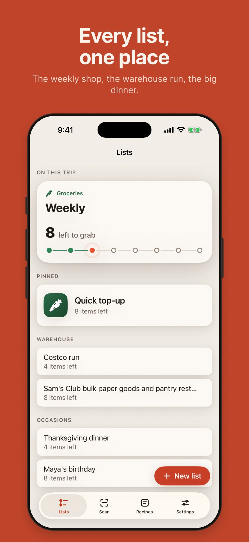
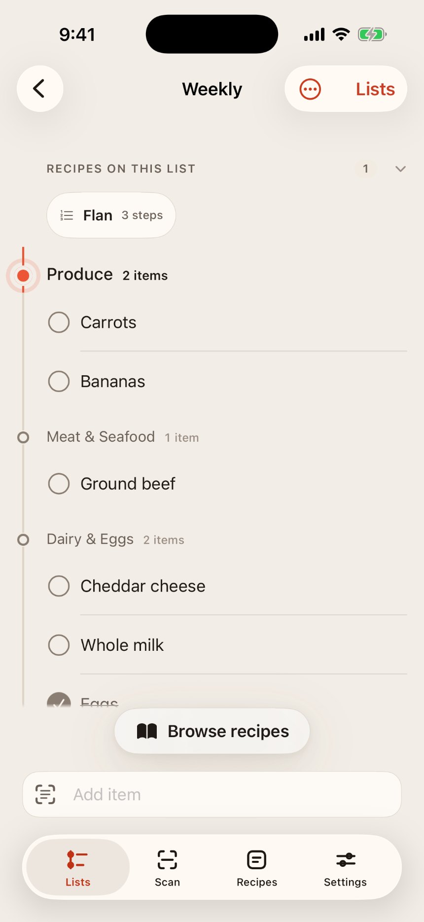
Copia is a native iOS grocery and recipe app built around the moment that matters (standing in the aisle, phone in one hand), not the moment of writing the list down.
Solo: design, interaction & engineeringNative iOS (SwiftUI) + SupabaseLaunching on the App Store this week
Coming soon (pre-launch)
12TestFlight build, feature-complete for 1.0
242automated tests (149 unit, 93 UI)
3shipped fixes from 2 live testers
The gap
Almost every grocery app optimizes the writing experience, then ships the same dense interface into the aisle. Five real problems (from watching someone shop, a tester report, or a friction hit personally) are the spine of what follows.
Desk vs. aisle
At a desk you have both hands and full attention. In an aisle you have one hand, a cart, and roughly a second per glance. The shopping surface had to be a genuinely different interface, not the same list with a checkbox.
Recipes trapped in formats a list can’t reach
Getting ingredients from a cookbook page onto a list means typing them one at a time, book held open, for a real nine-page cooking session. Scanning had to work at that length, trustworthy enough that no one proofreads every line.
Shared lists break on the household model
The obvious model (a household with shared lists inside it) fails immediately: weekly groceries go to a partner, party supplies to three friends, the hardware list to nobody. Invites had to belong to a list, not a household.
A list that loses data once is dead
Groceries are low-stakes individually, high-stakes as a habit. One silent sync failure permanently ends the app’s usefulness: the list can no longer be trusted. Correctness under concurrency isn’t a nicety here; it’s the entire product promise.
The first screen teaches the user what the app is
A first-run tester typed their entire shopping list into the list-name field. Not user error: the field asked “What’s this list for?”, a question about contents, with no label at all.
Decision 1 of 8: the reversal
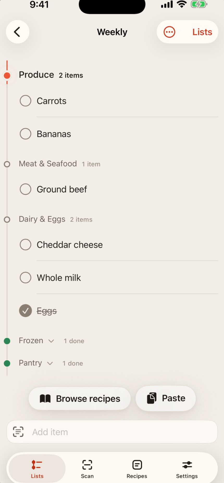
Removed the quantity number from the shopping row
The decision: delete the quantity display from the item row and its VoiceOver label. This reversed an earlier, explicit decision to keep it: “two onions means put two in the basket.”
Why it reversed: watching someone actually shop. At arm’s length, “eggs 3” doesn’t read as a count; it reads as a measure, like a size or a weight. The number degraded the scan rather than helping it.
What was kept: quantity is still stored, still merged, still what deduplication keys on. Only the display changed: three tests assert on digits rather than an exact string, so re-rendering it as “×3” would still fail the suite. The decision is pinned, not just implemented.
The cost, named honestly: real information loss for the small number of items where count actually matters. Accepted, because the failure mode of a misread number is worse than the failure mode of a missing one. A designer documenting they changed their own mind after watching a real person shop is the most persuasive thing on this page.
The shipped row, no quantity display: the earlier “eggs 3” version this decision reversed was never captured, since it no longer exists to screenshot; the reasoning above is the record of it.
Decision 2 of 8
Two timestamps for “the current trip”
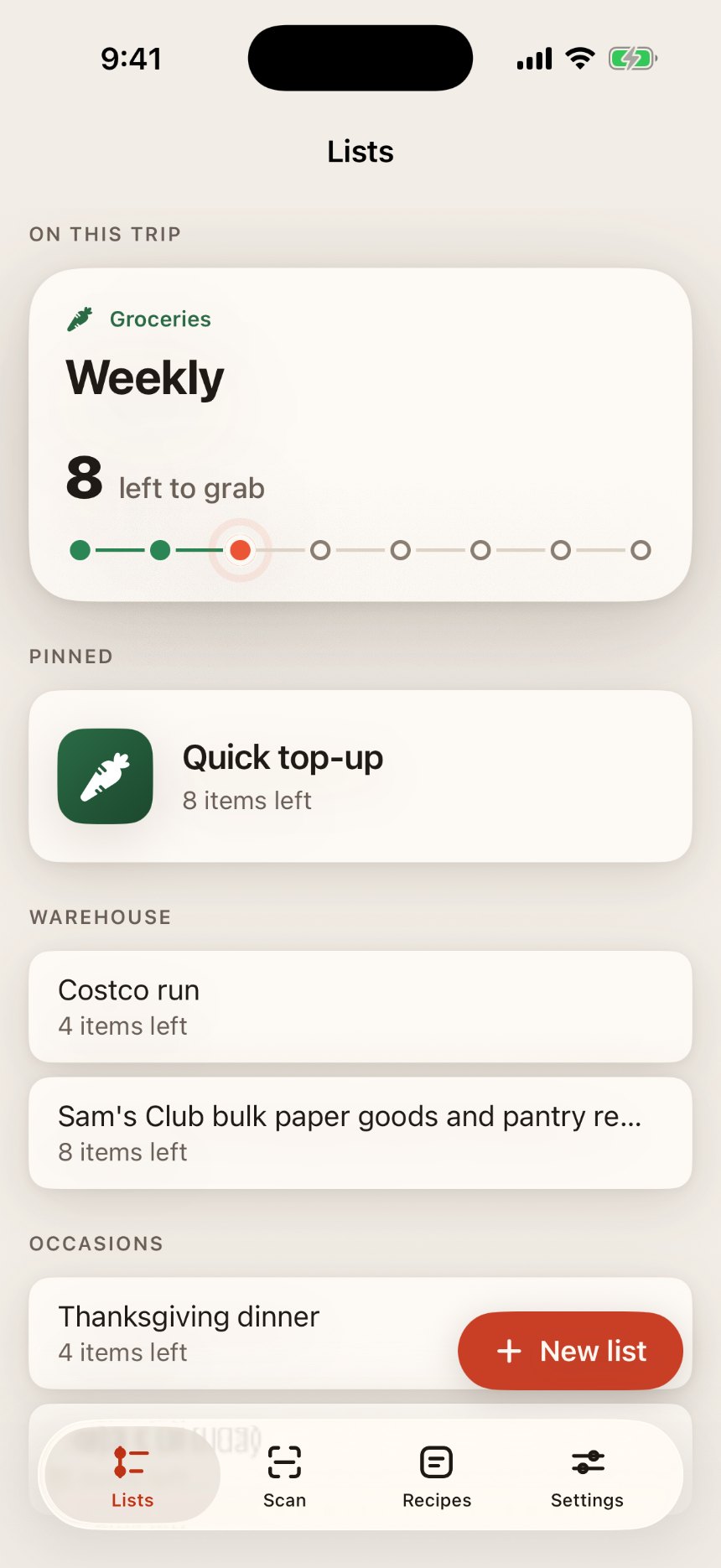
The home screen promotes one list to a hero card as the active trip. Promoting by most-recent-use meant any new list instantly seized the hero; filtering empty lists out fixed that, but then “make this the trip” couldn’t be offered on an empty list, exactly when you’d want it.
The decision: two separate timestamps: one that tracks ordinary use and promotes automatically, one that’s written only by the explicit “make this the trip” action. The bug looked like a broken menu; the real cause was one concept doing two jobs, not a broken control.
The hero card in question: “Weekly” is promoted here because of the second, explicit timestamp, not just because it was touched most recently.
Decision 3 of 8
Per-list invites, flat membership, list survives its creator
Invite people to a specific list by email. Flat membership for v1: no owner/editor/viewer hierarchy. The structural call: membership owns the list’s persistence, not a user; a list exists as long as it has one member, so deleting your account removes your membership, not the list. The alternative, a single owner, means the household loses the shared list the moment one person leaves.
The cost, named: auto-grant on claim means anyone who knows your email can put a list on your phone with no confirmation step: a lightweight confirmation screen is the fix, scoped as a follow-up rather than a blocker.
Decision 4 of 8
“Who got this” attribution
Checked items surface who checked them. In a two-person trip this is the highest-value piece of shared-list information: the difference between “is this done?” and “do I need to go back for it?” Attribution is stamped at push time, not toggle time, keeping user identity out of the model layer entirely.
Decision 5 of 8
Multi-page scanning as a designed flow, not a feature
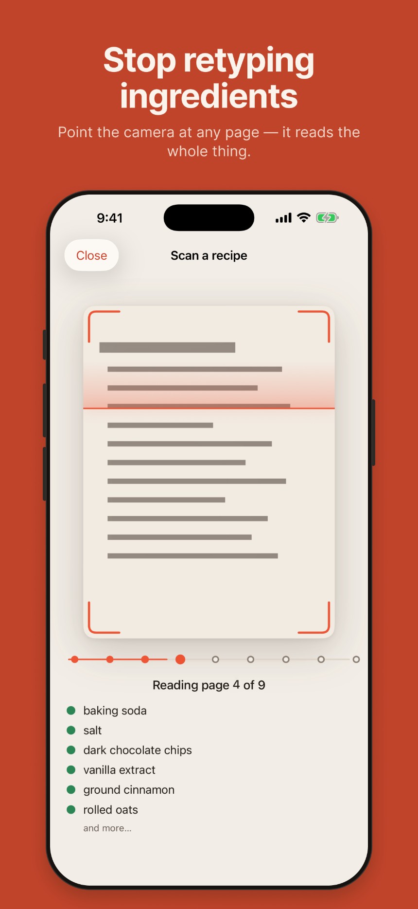
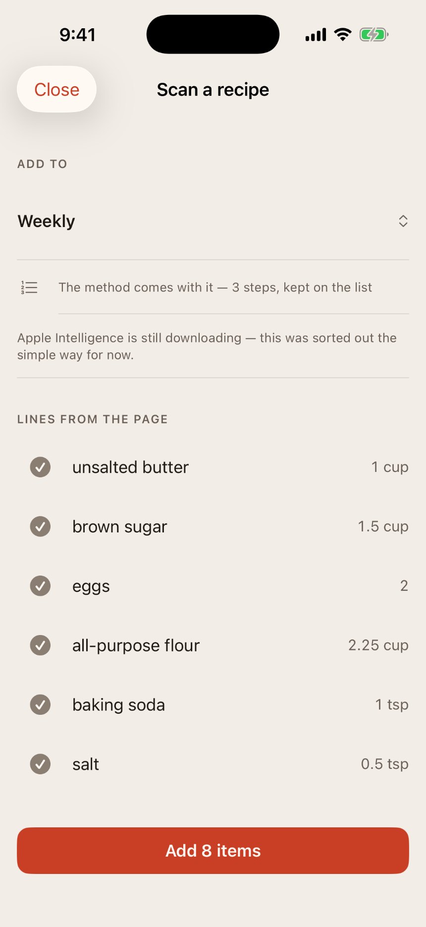
Scanning nine cookbook pages is a genuinely long wait. The flow was designed as an experience, not a spinner: a multi-select picker, a reorder strip, a progress rail, photo cycling, rotating copy, haptics.
The engineering decision that made it work: one model request per page, merged and deduplicated at the end, instead of one combined request: a bad page now costs one page, not the whole scan.
The scan in progress: a progress rail across the top, ingredients appearing as each page is read, not a spinner.The review step: parsed lines with their real measures, one tap from “Add 8 items.” The “Apple Intelligence is still downloading” line is the simulator’s own honest fallback to its on-device parser, not a bug, just absent on a real device.
Decision 6 of 8: planned, not yet built
Learning the store’s aisle order on-device
Infer a store’s walk-order by watching the sequence items get checked off in shopping mode, and apply it confidently after roughly three trips, with undo and manual reorder as the fallback.
The decision that matters: fully on-device, zero data collection: deliberately not a retailer API returning “real” aisle numbers, which would need an account and a network call. The inferred order is slightly worse and belongs entirely to the user; for a household utility, that trade is correct.
Decision 7 of 8
Labeling the list-name field
The fix for the first-run problem above: an actual label reading “List name,” and a placeholder reading “Name your list”: an instruction, not a question about contents. Small change, and the best single example in the project of a bug report that was really a design report.
Decision 8 of 8
Monetization: gate the sticky feature, cap by lifetime not by day
Initial proposal: three page-scans per day, then a one-time unlock. Pushback: de-emphasizing scanning was wrong: it’s the stickiest thing in the app and the reason people come back. If anything is worth paying for, it’s that.
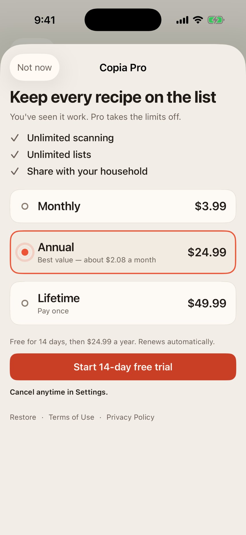
Landed on: a subscription plus a lifetime option, with a lifetime free-scan cap rather than a daily reset: a daily reset trains people to ration; a lifetime cap lets them experience the feature properly, then decide.
The shipped paywall: three tiers, annual pre-selected as best value, lifetime alongside it.
Building for trust
Groceries are low-stakes individually, high-stakes as a habit: one silent sync failure and the list can no longer be trusted, which ends the app’s usefulness outright. So the app works fully offline by design, never blocking on a connection, and every rule underneath it exists to protect that one promise rather than to be clever.
One bug is worth telling in full, because it’s a design bug wearing an engineering costume: the Lists header rendered completely empty on a real device, and every automated check still passed, because the underlying accessibility description claimed a heading that was never actually painted on screen. The checks were confirming the wrong thing: what the code claimed to show, not what a person would actually see. The fix was a check that looks at real pixels instead.
What testers changed
Copia shipped to TestFlight through Build 12, feature-complete for 1.0. Two live external testers produced three shipped fixes directly from their reports: the quantity-display reversal above, the invisible Lists header, and the list-name field. Independent of tester reports, three more sync failures surfaced under real concurrent use that automated testing alone could never catch, because none of them constructed the real-world condition: a hidden cap on how many items would load at once, edits that silently failed to register as changed, and a batch save that reported success while quietly dropping items. The app is pre-launch, so no adoption numbers here, and none invented: the evidence is decision quality and the failures caught before a real user hit them.
More of the app
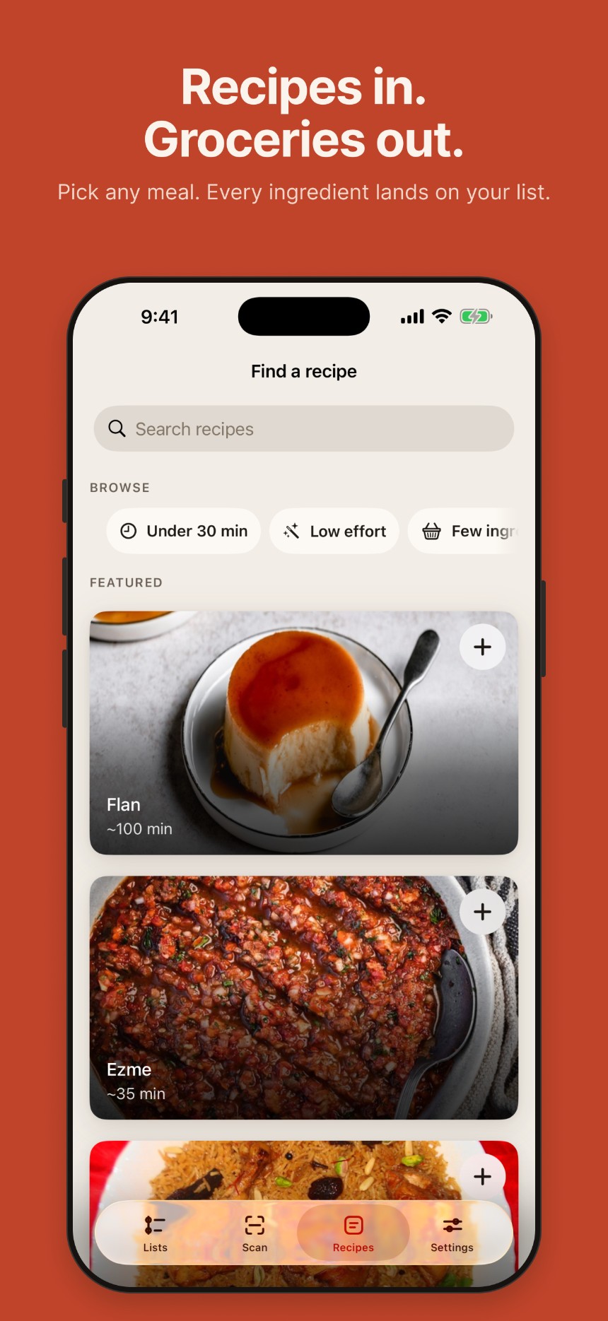
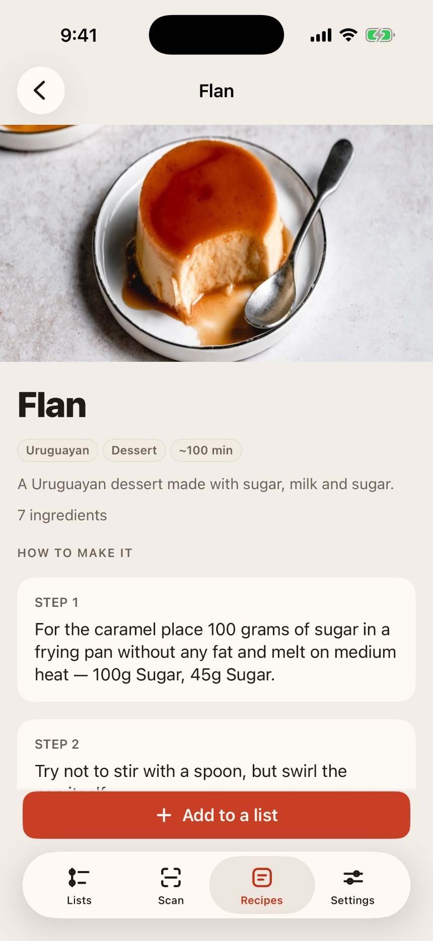
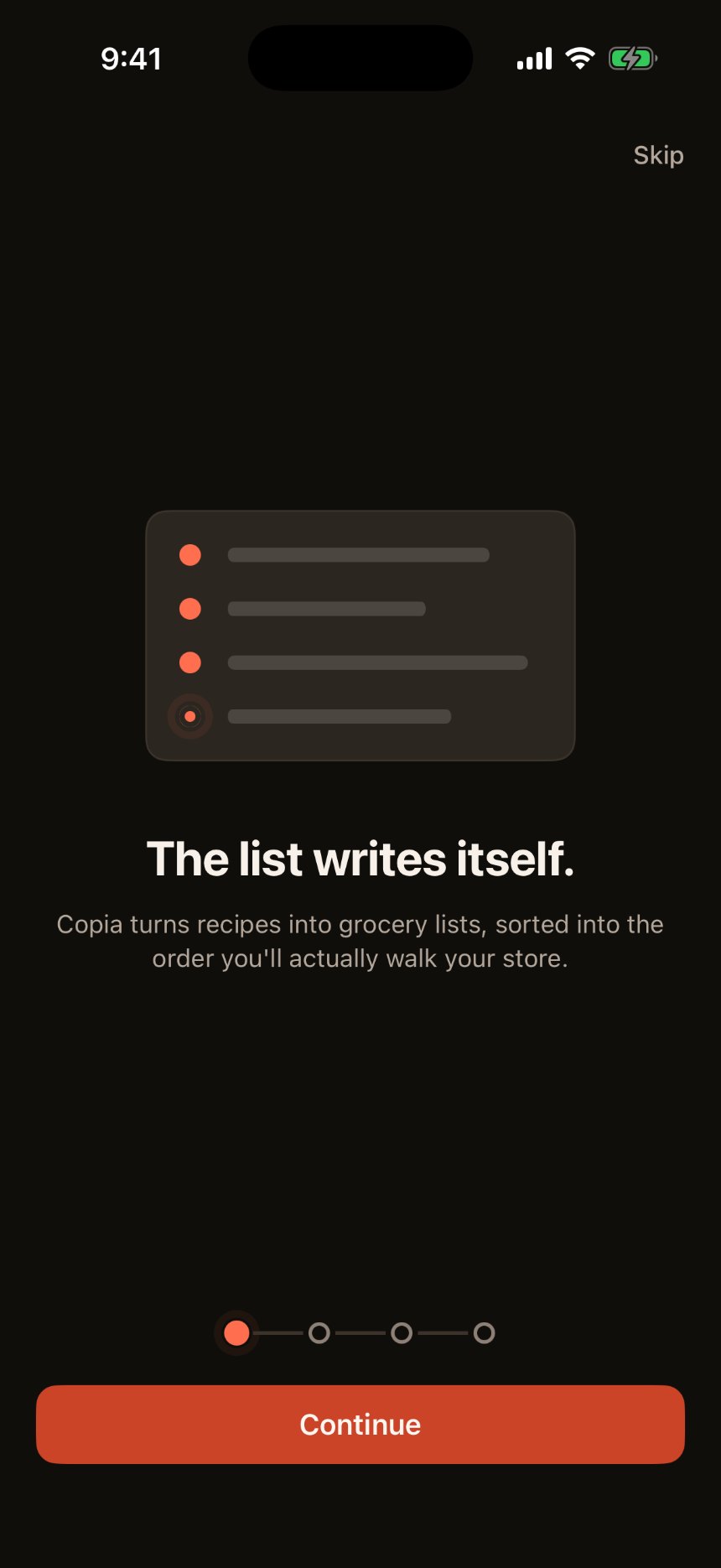
The recipe side of the same problem, and the first thing a new user sees.
Browsing: search, quick filters, real photography.Recipe detail: measures folded into the method, not a separate list to cross-reference.The loop closes: the recipe now lives on the list it was scanned into.First run: custom illustrations, not stock icons, from screen one.
The visual system
The organizing metaphor is navigation, not inventory: a grocery trip is a route with stops on it, so aisles read as stations. SF Pro stayed the typeface on purpose: the app’s differentiation is legibility at arm’s length, and a custom face would have bought brand recognition at the direct expense of that claim. Branding came from a warm color-token system instead. Light and dark appearance are both first-class throughout, not a system default left unstyled: every screen above exists in both.
Warm off-black: sampled from the shipped app
Coral / persimmon: sampled from the shipped app
Green: sampled from the shipped app
Warm neutral: sampled from the shipped app
What’s next
App Store submission: screenshots, store listing, in-app purchase products. Siri App Intent and a WidgetKit widget, gated on the App Group migration landing. Retailer cart integration: match list items to real products with a confirm/swap step, then hand off to the retailer’s own app for checkout. Copia never touches payment. The learned aisle-order feature above, once there’s enough real usage to learn from. A lightweight invite-confirmation screen. A VoiceOver pass on the multi-page scan picker.