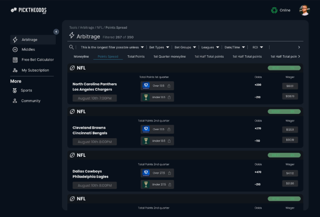
PickTheOdds pairs live sports odds with arbitrage math: a real analytical edge, buried behind a navigation bar that broke past five or six links and a filter panel nobody could parse at a glance. One month, brought in to fix the interface without touching the data underneath it.
31%faster to select a betting category, after grouping filters
25%increase in user retention
84%increase in average time on site
10×growth in daily active users (50 to 500+)
The gap
The backend data was genuinely good: real odds, real arbitrage math. The frontend was actively working against it. Four real problems, the spine of what follows.
Navigation and filters that couldn’t scale
The nav bar’s spacing broke past five or six links, so the product was structurally capped at how much it could expose. Filters sat ungrouped and oversized on top of that, so even the categories that did fit were hard to browse. Same root cause, two symptoms: nothing had a hierarchy.
Too many clicks between the odds and the bet
Getting from an odds view to the matching game view took more clicks than the decision itself warranted. For a product whose whole value is speed to a good line, every extra click was a direct tax on the thing users were there for.
A visual identity that undersold a real analytical edge
The interface read as dated, not sophisticated: a mismatch for a product whose actual differentiator is data quality. Looking less capable than the backend actually was is its own kind of trust problem.
No path to revenue at all
There was no subscription or billing flow anywhere in the product: a real business with no monetization built in yet, not a product decision so much as a missing one.
Decision 1 of 3: the evidence-backed one
Group the filters, don’t just shrink them
The instinct with an oversized filter panel is to make everything smaller. That would have shipped the same broken hierarchy in less space. The actual problem was that every filter sat at the same level: nothing told a user which ones were related.
What the research said: a direct poll inside PickTheOdds’ own 700+ member Discord community found 68% of users considered the filter system too slow, and 72% said they’d pay for a better one: a real, business-relevant signal, not just a usability complaint. That finding shaped the fix directly: filters were grouped into categories and A/B tested against the ungrouped version.
What it changed: grouping filters into categories cut the time to select a betting category by 31%: the single most direct before/after number from this engagement, and the one the rest of the redesign’s case rests on.
Decision 2 of 3
Cut the distance between odds and the bet
The path from viewing odds to reaching the matching game view had more steps in it than the decision itself needed. For a product built around speed to a good line, that gap was a tax on the core loop, not a minor friction point.
The decision: the navigation and information architecture were rebuilt around minimizing clicks specifically between the Odds and Game screens: the one workflow every user runs constantly, prioritized over polishing paths used less often.
What it changed: a shorter core loop is the most direct explanation for the two engagement numbers that moved most: 84% more time on site and a 25% lift in retention. Users weren’t spending longer per task; they were completing more of them per visit.
Decision 3 of 3
Design monetization in, not bolt it on
The product had no subscription or billing flow at all: a real gap for a business that needed one, not a feature to skip for scope. Adding one after the fact, as a separate settings page bolted onto the existing IA, would have read as an afterthought and fought the same navigation problems Decision 1 and 2 were already fixing.
The decision: subscription and billing were designed as part of a single, centralized account control panel from the start: one place a user manages their plan, not a scattered set of screens.
What it cost: more upfront account-architecture work than a bolted-on settings page would have needed, in a one-month engagement that couldn’t really afford it. Worth it against the alternative of shipping a monetization flow that undercut the navigation fix happening everywhere else on the same product.
Research, then a system
Nothing here started from a visual redesign. It started with a direct line to the people already using the product: the 700+ member Discord community above wasn’t polled once and forgotten; it shaped every phase that followed.
01
Community research
Direct polling in the Discord, live feedback sessions on the navigation-to-odds transition specifically.
→
02
Low-fidelity wireframes
Mapped the navigation structure and filter groupings before any visual work started.
→
03
Community iteration
Wireframes went back to the same community that flagged the original discoverability problem.
→
04
High-fidelity prototypes
Interactive prototypes, usability tested before anything shipped.
→
05
Visual language
Color, typography and iconography built last, on top of a structure already validated with real users.
The result
Daily active users grew 10x over the course of this work (50 to 500+) alongside the 25% retention lift and 84% increase in time on site above. None of that is attributable to one change in isolation, but the filter and navigation fixes were the two structural changes underneath all three numbers moving together.
“The new navigation and filters are a game-changer. Engagement and subscriptions have never been higher.”
Ken Bean, Founder, PickTheOdds
The visual system
The writeup this case study is built from describes the broader redesign as moving toward a lighter theme, updated typography and a refreshed logo. The one real artifact available (the arbitrage dashboard screenshot above) tells a more specific story: it’s dark, not light. Rather than assert the broader claim against evidence that contradicts it, the swatches below are sampled directly from that real screenshot’s actual pixels, not typed in from memory or invented to match the writeup.
A dark, data-dense core view alongside a lighter marketing or account surface is a common, deliberate split for this category of product: traders and bettors generally want the working view dark. That may well be what happened here; it just isn’t what this one screenshot can confirm on its own.
Base background: sampled from the dashboard
Panel surface: sampled from the dashboard
Positive-odds accent: sampled from the dashboard
Border / secondary text: sampled from the dashboard
Impact, in detail
Every number below is from the same engagement, not a separate analytics pull.
31%faster category selection
25%retention increase
84%time-on-site increase
68%of surveyed users found filters too slow
72%said they’d pay for a better one
Daily active users, before and after
A real 10x: normalized to the after value below.
Before~50 DAU
After500+ DAU
What’s next
This was a one-month, scoped engagement: there’s no ongoing roadmap on this end to report. What carried forward from it is a pattern this portfolio keeps returning to: a research-backed information- architecture fix (grouping, not just shrinking) outperforming a purely visual redesign, and a monetization flow designed alongside the core product instead of bolted on after. Both show up again, in different domains, in Copia and Vault.